Tag Archive for: Infographic

The Most Important Email Marketing Elements For 2016 (Infographic)

This article was posted as a Guest Blog Post by our affiliates at OnBlastBlog.com 

Let’s get one thing straight: email marketing is not dead, nor is it dying. It is still one of the most effective means of generating leads and conversions for a business. The old ways may have died, but there are new elements rising into the spotlight that change how we look at our email campaigns.

Today I’ll share several of the email marketing elements you should be using in 2016, followed by an infographic filled with the latest strategies that you can implement into your next campaign.

Today’s Top Email Marketing Trends and Strategies (Infographic)

You should start by avoiding the most common email marketing mistakes. Now, let’s look at some of the most important elements in any modern strategy:

  • Marketing automation such as drip campaigns and triggered message series are becoming more important to manage and nurture leads.
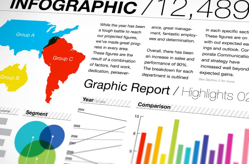
  • Segmenting your email lists based on a variety of factors (such as whether they’ve purchased or not) will ensure that your emails are personalized and relevant to each category.
  • Provide timely and relevant communication that addresses their needs.
  • Offer exclusive content they can’t get any other way.

Email marketing is a powerful tool in the right hands. Check out the infographic below for a closer look at today’s top strategies and let us know how it helps you in the comments!How to Send out Emails Like a Professional

Should You Be Creating Infographics For Your Company?

Should You Be Creating Infographics For Your Company?Creating infographics is one great way to share information with your audience base. For many small businesses, one of the main challenges in creating infographics is finding the time or the talent. It’s also important for small business to integrate graphic creation into an already-existing content strategy, rather than making them chief in the strategy.

Network dissemination is also important to consider – if you’re only using Twitter and you’re posting mostly infographics, chances are your audience will never see this content. Finding network-appropriate content should be part of your overall marketing strategy.

Is Creating Infographics Difficult?

Pretty much anyone can use a free graphics editor and slap together an infographic, but keep in mind that your audience wants to see streamlined content. The difference between a low-quality and high-quality infographic is something your audience doesn’t have to be graphics experts to pick up. Other businesses have set the bar with high-quality graphics and content, so it’s important to ensure that a graphics and design expert is looking over or even making your creations.

So is creating infographics difficult? Not necessarily – but creating high quality infographics is something you might need some help with. If nothing else, high quality templates are available for purchase from stock photo sites. You can always use a simple photo editor and modify these to suit your needs.

Diversifying Content

We’ve talked about how creating a content strategy that fits what your audience wants to see is the most important thing you can do. Once a small business gets a good method going for creating and disseminating infographics, these graphics often overtake a business’s social media stream.

Treat the infographics created by your company as you would any other type of content. Make sure that you’re measuring responsiveness – do more people comment, like or share infographics than they do text or image content you release? Do you find your numbers dropping when you use more or less graphics? As with any other social media content, the way you use graphics in your social media feed is an experiment at first. If you find tons of people responding and engaging when you post infographics, you’ll want to make sure. Opposite results should yield less infographics in your social media streams.

Brand Your Company

Don’t forget to include your company’s branding – including company name and logo – in your infographics. You don’t want another company sharing your images and taking credit for them! Branding ensures people will know the useful and beautiful data they’re seeing comes from you.

Your infographics should contain great data as well as beautiful imagery. Let us help with the data! Our content writers can put compelling stats together for your images. Talk to the Lead Liaison team about getting social media and content help for your company ASAP!

The Consequences of Poor Lead Management

Consequences of Poor Lead ManagementInfographics are an easy, eye-catching way to discuss issues in today’s B2B environment. We recognize how helpful infographics can be in developing a lead management strategy. So we’ve produced a colorful, extensive lead management chart, which should help small to mid-size companies struggling with how they should manage their lead generation process. We call it, The Consequences of Poor Lead Management.

Often, infographics are built on statistics. Statistics provide reference points as to what industry players are doing and the results from their activities. That is why we’ve built this infographic on 10 major statistics that are referenced within the revenue generation industry.

The infographic breaks down the most quoted lead management statistics available:

  • % of buyers who research purchases online
  • % of marketing leads not passed to sales
  • % of leads that will never be followed up
  • % of sales teams with no process to re-qualify leads
  • Likelihood of leads converting if contacted within five minutes of a query
  • Average number of attempts required to make contact with a lead
  • % of marketing campaign respondents who are ready to buy immediately
  • Likelihood of lead qualification if contacted within one hour of a query
  • % of companies with no standardized sales and marketing processes
  • % of leads initially disqualified that buy within 12 months

The infographic flow chart displays ten consequences of poor lead management. Within each consequence there are extensions which highlight 2 to 17 effects of a poor lead management strategy. From every set of effects there is an outcome that results from each specific issue. This adds up to over 70 details about the consequences of poor lead management!

The infographic is intended to assist small to mid-size companies in addressing their lead management process. Lead Liaison executives hope that, by providing this information in an easy-to-follow format, the infographic can be used as a tool for boosting lead management effectiveness. By adressing the issues detailed in this free chart, companies can improve revenue generation.

The chart may be downloaded and printed so executives can easily reference the details. Check out the lead management infographic today and contact Lead Liaison for ways to improve your lead management process.

Download this infographic.

Embed Our Infographic On Your Site!